Building a modular, data-dense table system to empower users and increase team velocity at Caplight
Building Functional, High Density Data Tables for the Private Markets
Project Overview
Caplight is a fintech platform enabling brokers, investors, and analysts to navigate private markets. Focused on secondary trades and data insights, Caplight supports its users in discovering pricing trends, conducting comparisons with public and private firms, and accessing up-to-date data. Additionally, Caplight provides brokers with an all-in-one solution for managing clients and orders, leveraging AI-driven match suggestions, and facilitating trades in secure environments via both darkpool and lit market options.
In this project, I designed a highly functional table component system, foundational to the platform, that addressed both the needs of Caplight’s sophisticated users and the goals of our engineering team. This case study details the design journey, challenges, and decisions that led to a modular, high-density table solution.
Objectives and Requirements
Caplight’s data-centric platform demanded a table component that could handle vast quantities of financial and client information. Users accustomed to tools like Bloomberg terminals and Excel required a solution that combined flexibility and density, without overwhelming visual clarity. Key requirements included:
Consistency and Aesthetic Quality: A unified, visually cohesive table system that could be quickly implemented by designers and engineers, enabling a polished, reliable interface.
Modular and Extendable Design: Tables had to adapt easily across diverse use cases, with a component-based approach supporting Caplight’s rapid feature growth.
Data Density with Clarity: Users needed access to extensive data within constrained screen sizes, requiring a layout that balanced high information density with clear, intuitive reading.
Adaptability to Complex Financial Data: Tables had to accommodate financial data conventions while remaining adaptable, clear, and interactive.
Building the Table Framework: Headers, Core Cells, and Hierarchy
Header Design: Clarity, Flexibility, and Customization

Header cells set the foundation for a visually organized table system, defining not only what data is displayed but also how users interact with it. I standardized the following header elements to establish clarity and hierarchy:
Core Elements: Every header includes a label, optional checkboxes for "select all" functionality, sort icons, badges for additional context, and the potential to add icons for specific actions. This design minimized the number of component variations, reinforcing consistency and simplifying updates.
Checkboxes and Select All Feature: For tables requiring bulk actions, such as large-scale order management or client selection, checkboxes were implemented in first-column headers. This helped users manage selections quickly, with clear visual feedback.
Sorting and Filtering: Sorting functionality was crucial for tables with highly varied data sets. I ensured each sortable header displayed a subtle, intuitive sort icon, clarifying the sorting state without disrupting the table’s visual flow.
Badges for Status and Feature Context: I created a badge system to highlight new, beta, or unique table features, allowing users to easily identify and explore updates. This unobtrusive addition keeps users informed without overwhelming them.
Core Cells: Defining Functionality and Readability Across Use Cases

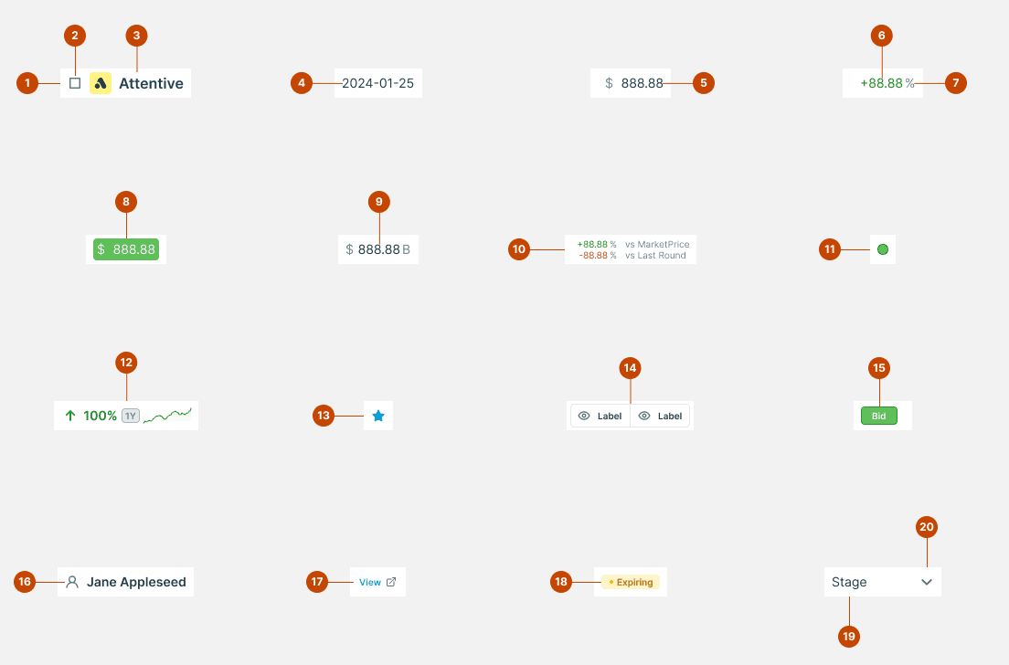
In collaboration with the product and engineering teams, I identified seven core cell types covering 90% of the data displayed across Caplight. Each cell type was designed for a specific content type and optimized to enhance readability and functionality:
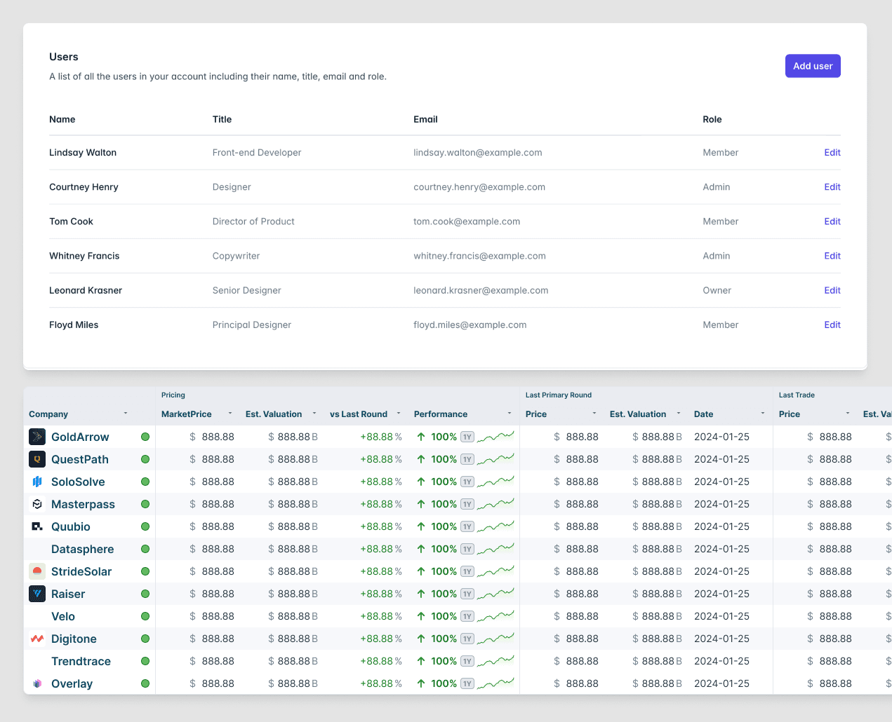
Company Names with Logos: Approximately 80% of tables required a company column displaying both a name and logo. For visual consistency, I created a reusable component accommodating varying logo sizes and names while preserving a clean visual line across the table. This cell also adapts dynamically to different screen sizes and maintains readability at reduced widths, key for Caplight’s dense tables.
Contact and Client Tracking: Given Caplight’s broker management tools, a flexible contact cell was essential. This cell displayed complex data, including the client’s name, organization, role, and relationship type (e.g., firm, shareholder, broker). I prioritized a hierarchy of elements, placing primary information prominently and secondary details in smaller, less intrusive text, ensuring scalability for future data extensions.
Integer and Financial Data Cells: Displaying numbers clearly is critical in finance. I conducted user testing with various layouts (e.g., left-aligned, right-aligned, or currency-separated) and learned that our users preferred right alignment for easier scanning. While this choice diverged from conventional design advice, it highlighted Caplight’s user-centered approach.
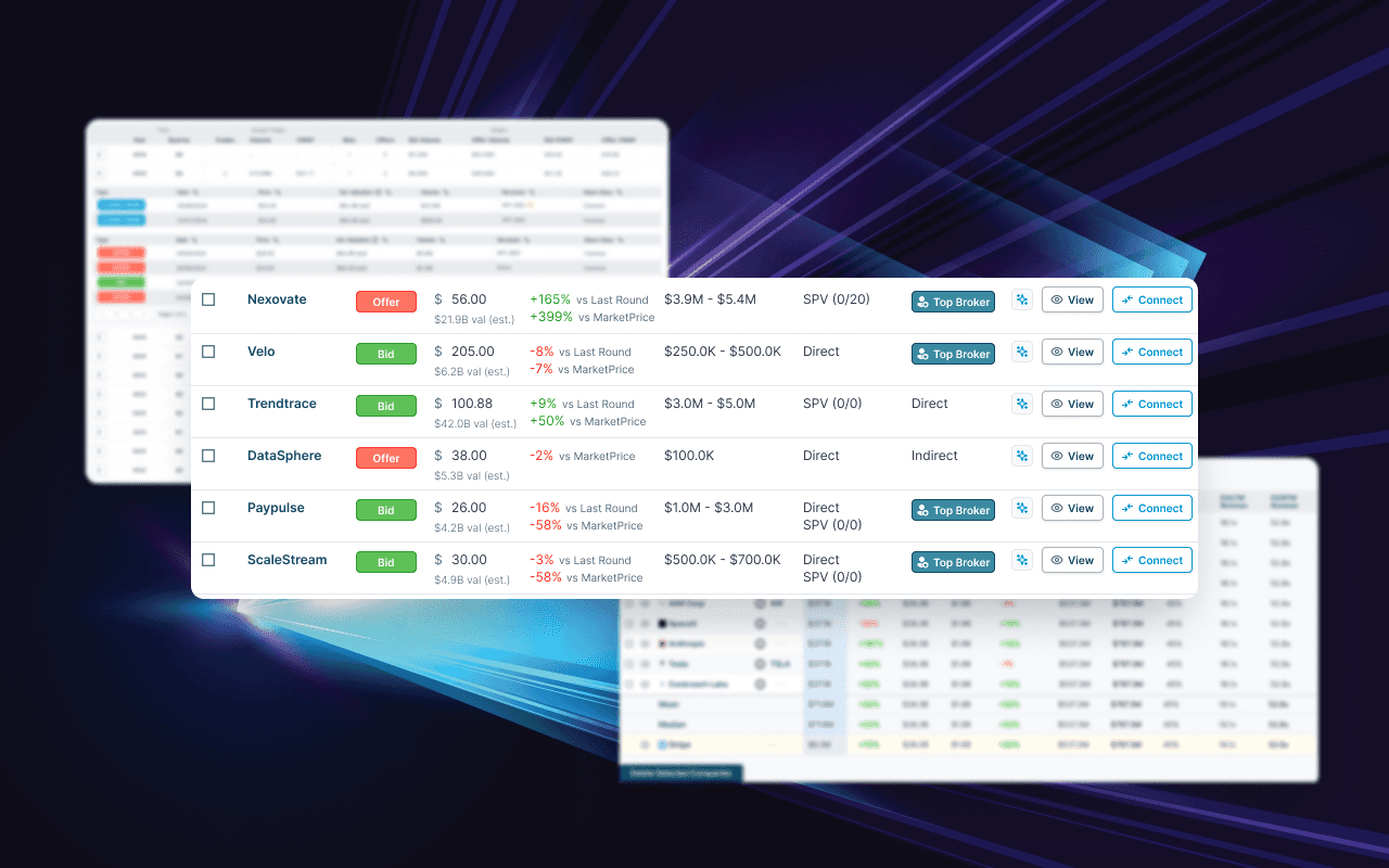
Tags and Label Cells: Used for descriptive data points like deal status or broker types, tags required a distinctive but subtle appearance to avoid visual clutter. I used compact, rounded shapes for tags, maintaining color differentiation for clear categorization while preserving the overall table’s clean lines.
Sparklines: To provide quick financial insights, we integrated sparkline mini-charts within cells to visualize trends over time. These charts offer immediate, at-a-glance data without requiring users to leave the table context.
Date Cells: These required a standardized date format with lightweight font treatment to allow easy scanning. By aligning date cells consistently across tables, I maintained visual stability and aided comparison.
Button Cells for Actions: For tables where users need to take quick actions (e.g., following up on a client order), I incorporated button cells and button groups. These buttons were designed with a subtle hover state and clear action labels, minimizing the risk of accidental clicks.
Visual and Spatial Clarity: Balancing Density with Readability
Balancing high information density with clarity was one of the most complex design challenges. Given the data-intensive nature of Caplight’s platform, I maintained tight control over spacing and alignment:
Baseline Grid for Consistency: To unify the spacing across text, icons, and images, I implemented a baseline grid system. This approach created a structured rhythm across the table, allowing users to navigate extensive information without visual fatigue.
Spacing Adjustments for Readability: Due to varied screen resolutions and scaling, I adjusted the table cell spacing to ensure legibility while maximizing data per screen. Fine-tuned padding and margins, particularly in integer cells, improved readability without compromising data density.

Tailwind CSS Integration: Customization and Collaboration with Engineering
Caplight’s frontend stack relies on Tailwind CSS, which provides utility classes that speed up development. However, Tailwind’s default styles were too “retail” for Caplight’s professional, data-intensive needs. I worked closely with the engineering team to develop a custom Tailwind system that balanced Tailwind’s flexibility with Caplight’s unique requirements.
Extending Tailwind for Finance Applications: By building custom classes on top of Tailwind’s base, I created components that reflected financial sector standards. For example, currency symbols were separated from integers, and custom styles were introduced for numeric data.
Learning Tailwind’s System as a Designer: I immersed myself in Tailwind’s class-based system to improve collaboration and communicate effectively with engineers. This knowledge allowed me to bridge the gap between design and development, ensuring our styles met user expectations without sacrificing development speed.

Enhancing User Interaction with Context Menus
Exploratory users benefit from on-demand context menus, so I incorporated them within key table components to streamline user actions. These menus, available on right-click, allow users to:
Access client details without leaving the table view.
Perform quick actions, like sending notifications or exporting data.
Each menu includes only the most relevant options, minimizing clutter and guiding users intuitively through task flows.
Efficient Prototyping with Dummy Data for Design Consistency
As Caplight’s platform scaled, creating realistic prototypes became essential to UX testing. Initially, each table required manual cell population, slowing design and engineering workflows. I led the development of precomposed dummy data for prototyping:
Consistent Data Mocks: Each primary column type (company, pricing, dates) was populated with 10-25 pieces of realistic dummy data, expediting design workflows and creating consistent test environments.
Improved Prototyping Speed: Predefined data sets eliminated repetitive data-entry tasks, enabling designers and engineers to build and test tables quickly.
Reflections and Impact
The Caplight table component project successfully delivered a high-density, modular table system that met user needs and enabled scalable, consistent design for future platform expansion. This project reinforced the importance of detailed cross-functional collaboration and adaptive thinking in UX design.
Key Outcomes and Lessons
Efficiency Gains in Development: A standardized table framework and dummy data dramatically improved development cycles.
User-Centric Flexibility: Contextual menus and badge systems support user interaction without overwhelming the interface, aligning with user behavior.
Tailored Tailwind Integration: Extending Tailwind’s styling system ensured the platform maintained a professional, finance-oriented look and feel, essential in the fintech space.
This project underscores my approach as a designer who anticipates user and engineering needs, balancing aesthetic detail with technical feasibility. Through strategic thinking and collaborative problem-solving, I contributed a table system that elevates Caplight’s platform to the professional standards expected by its users.
Learnings
This project laid the foundation for a high-density, modular table system that meets the complex needs of Caplight’s users, balancing clarity with data-rich design. Working closely with engineering, we created a component that aligns seamlessly with Caplight’s aesthetic and functional goals, allowing for flexibility as the platform evolves. As Caplight continues to scale, this table system ensures a cohesive, high-impact data experience that will support the platform’s growth and help users navigate private markets with greater insight and ease.
