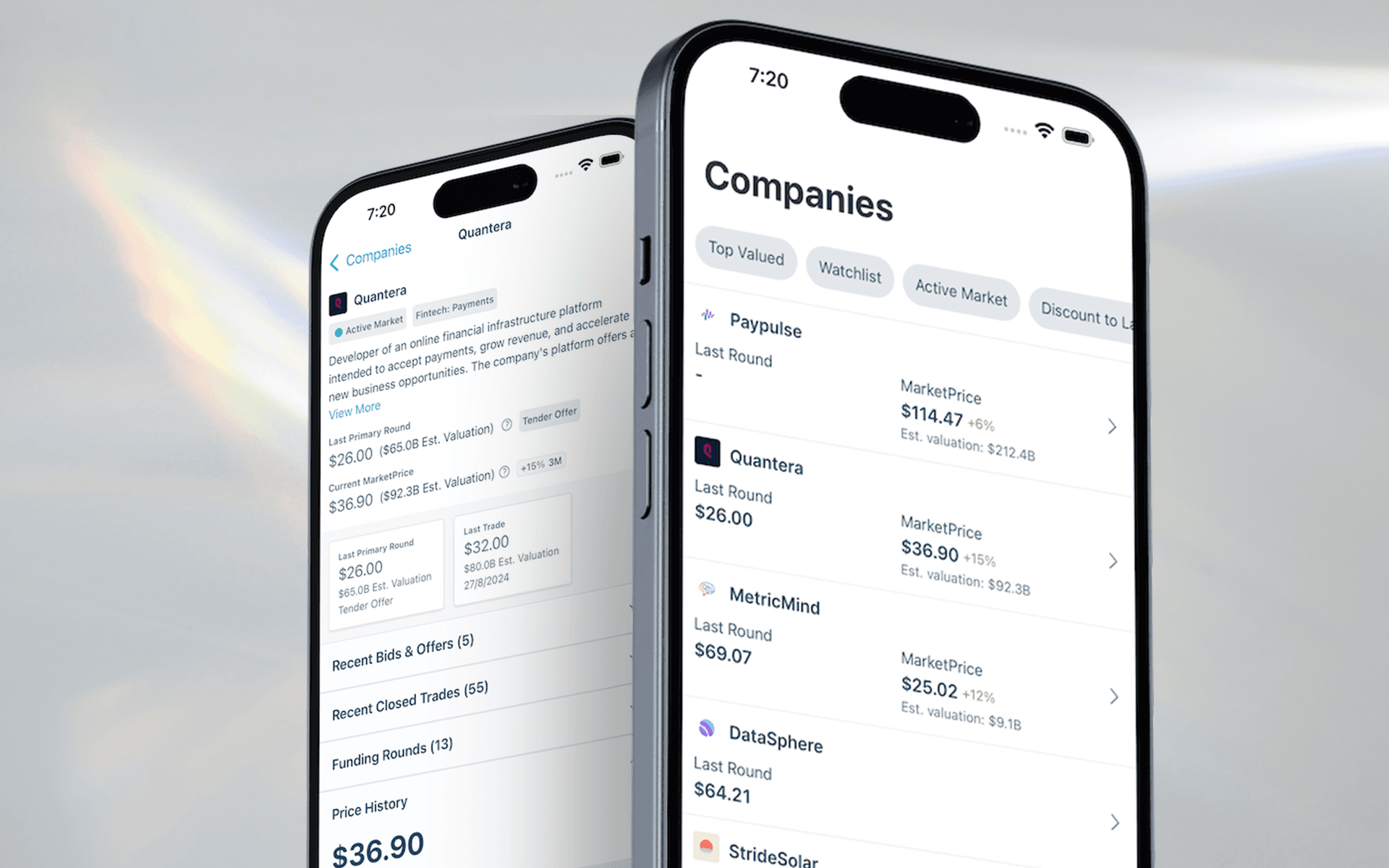
Designing mobility for private markets: thoughtful, focused, and impactful.
Caplight Mobile App: Redefining Private Markets on the Go
The Problem: Adapting a Desktop-First Platform for Mobile
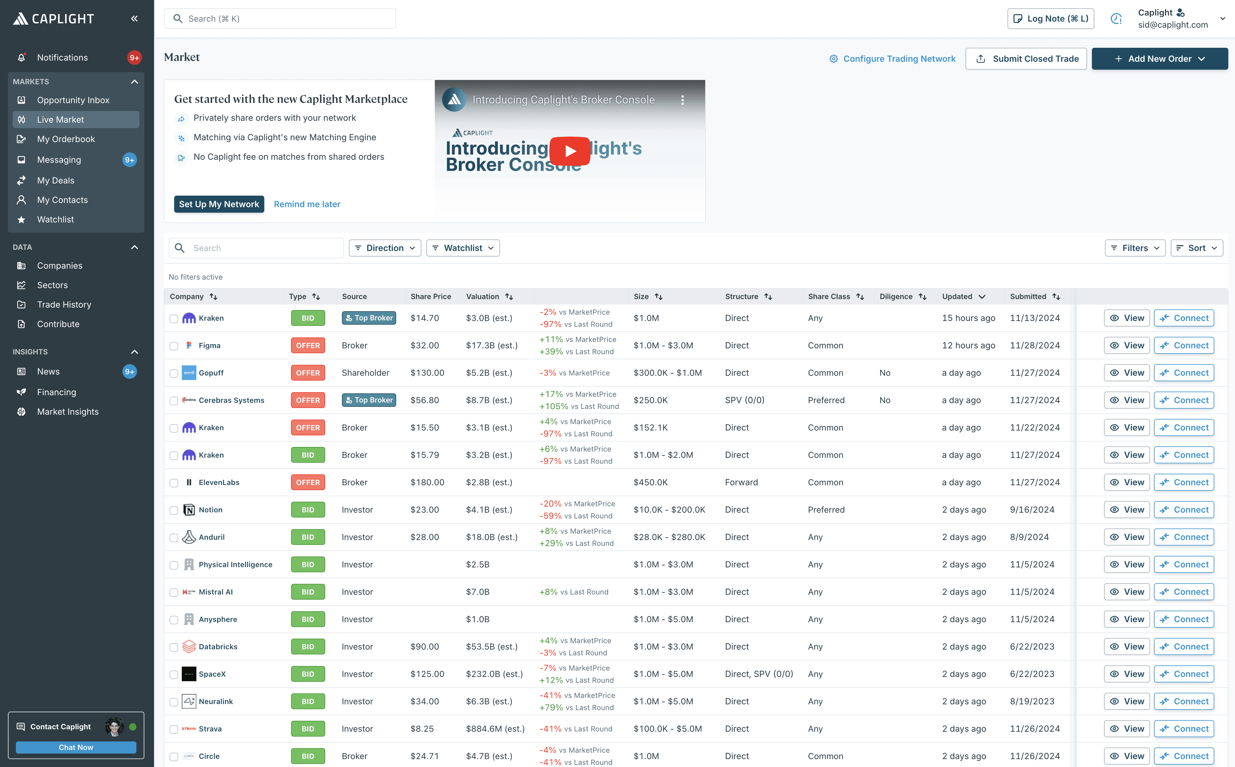
Caplight was born as a desktop-first platform, optimized for users working across large monitors with dense tables and advanced workflows. While the web app was technically responsive, the functionality had never been fully adapted for mobile screens. This led to several challenges:
Limited Responsiveness in Practice:
While the foundations of the web app were responsive, the design relied heavily on dense data tables and workflows that were impractical on small screens. Viewing data on mobile often felt cramped and cumbersome, with little consideration for usability in such contexts.Accessibility Challenges:
The density of data required by our users often clashed with accessibility guidelines, creating friction between the product team’s need for clarity and business development’s demand for feature-rich functionality. Striking this balance was an ongoing challenge.Low Mobile Priority:
A mobile experience had long been desired but was never prioritized during the product’s development cycle. This meant the product grew without a mobile strategy, leaving users with limited options for engaging with the platform on handheld devices.Rapid Product Evolution:
Caplight’s rapid growth outpaced its foundations. With the product evolving quickly to meet user demands, a fully responsive experience became unfeasible under the constraints of the existing roadmap. The result was a growing need for dedicated mobile functionality to meet user expectations.
These issues became increasingly apparent as users requested better tools to access their orderbooks, research companies, and pull up pricing information while on the move. Addressing these problems required a fresh perspective—one that treated mobile not as an afterthought, but as a strategic extension of the platform.
The Vision Quest: A Research-Driven Foundation
Mobile-first was a foreign concept for Caplight when this project began. The idea wasn’t just to “shrink” the desktop platform; it was about rethinking user needs in a mobile context. To get started, I initiated a comprehensive research spike aimed at understanding not only what users wanted but also what they didn’t know they needed.
Key insights emerged from user interviews, behavioral analysis, and competitive research:
The mobile user isn’t stationary: Brokers and asset managers wanted Caplight to be their portable assistant—providing quick access to pricing data, orderbooks, and client research while moving between meetings or during calls.
Simplicity is non-negotiable: Unlike the deep workflows of the desktop app, mobile users craved streamlined experiences that reduced cognitive load.
Constraints drive creativity: We couldn’t bring the entire desktop experience to mobile, but we could focus on high-value actions that complemented desktop usage.
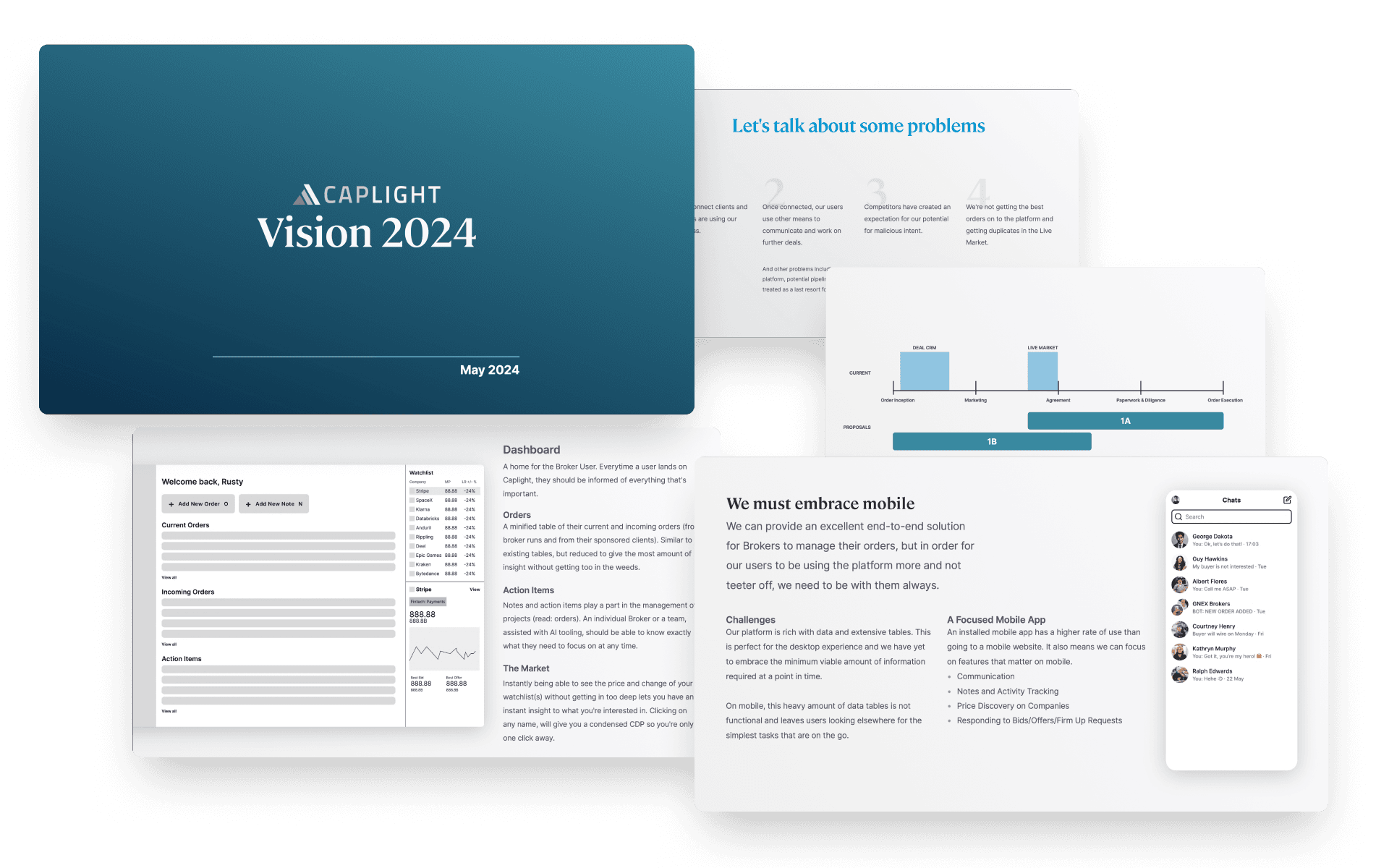
I articulated this vision in a presentation, alongside other improvements to the overall experience for the future of Caplight. One of my case studies drew parallels to examples outside of the traditional Fintech-SaaS product: Ableton Live.
Ableton Live is a music production suite for musicians producing arranged and live music. As a complete offering, it requires a full desktop experience and has been a staple in the music industry. With the advent of mobile technologies, the company wanted to respond to users feedback about being able to produce music on the go and not be locked to their desks.
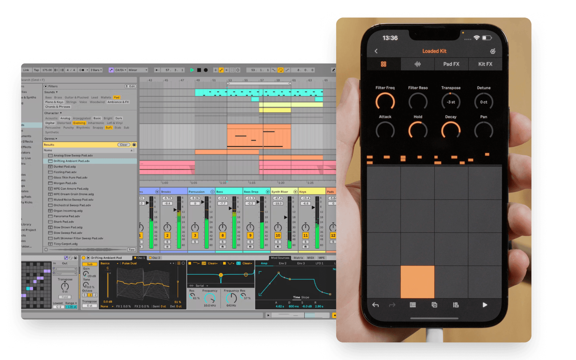
Rather than trying to shrink the Live app down to a phone or tablet size offering for a worse experience, they instead built a companion app that could standalone. Removing the complexity of plugins, gigabytes of instruments and effects, the Ableton Note app acted as a lightweight and focused sketching tool for musicians to capture inspiration on the move. This would then sync up to the cloud and when the artist got back to their workstation, they could continue the flow of inspiration. This presentation helped align stakeholders, driving enthusiasm for a curated mobile app that met users where they were—literally.
Designing for Constraints
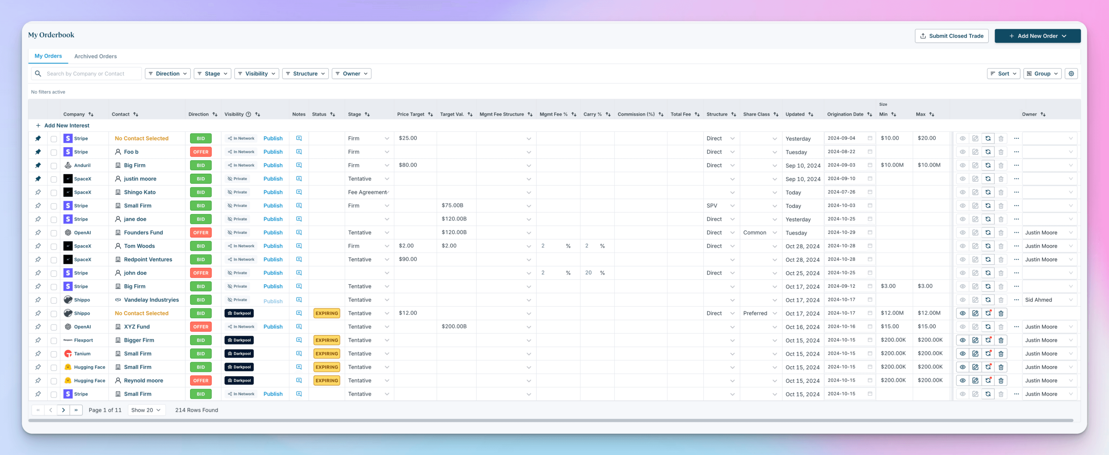
One of the most complex challenges was translating Caplight’s Orderbook—a data table with over 10 columns—into a mobile-friendly format. The desktop design, optimized for large screens, was unusable on mobile.
Defining Key Information
Through our research, we identified the most valuable information for mobile users skimming their Orderbooks:
Company Name: The entity the order is listed for.
Order Direction: Whether it’s a bid or offer.
Order Size: The volume of the order.
Visibility Status: Whether the order is private, in the Darkpool, or on the Live Market.
Order Status: Expiration terms, matchability, and other critical updates.
This was critical information that the user needed to have in order to know what each order was and it's relation.
Lo-Fi Designs: Building the Blueprint for Success
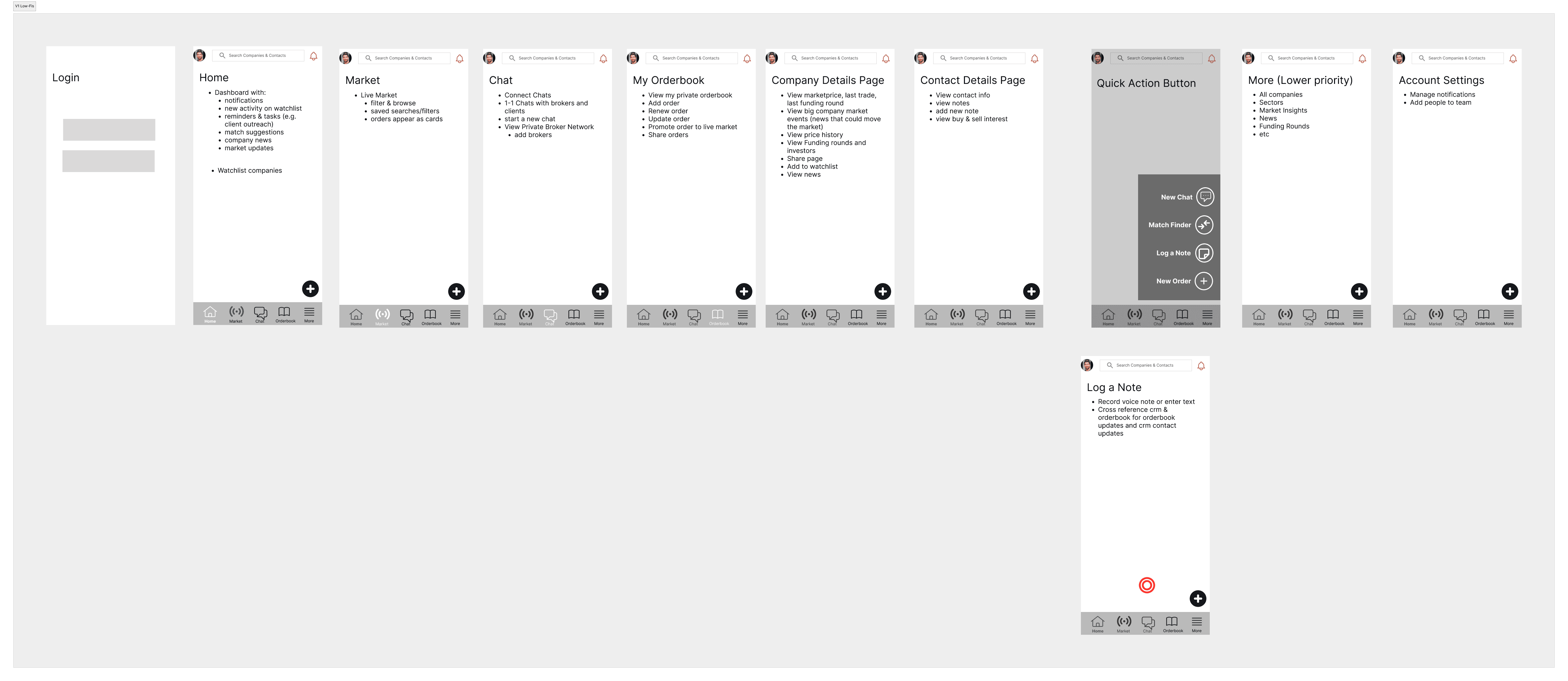
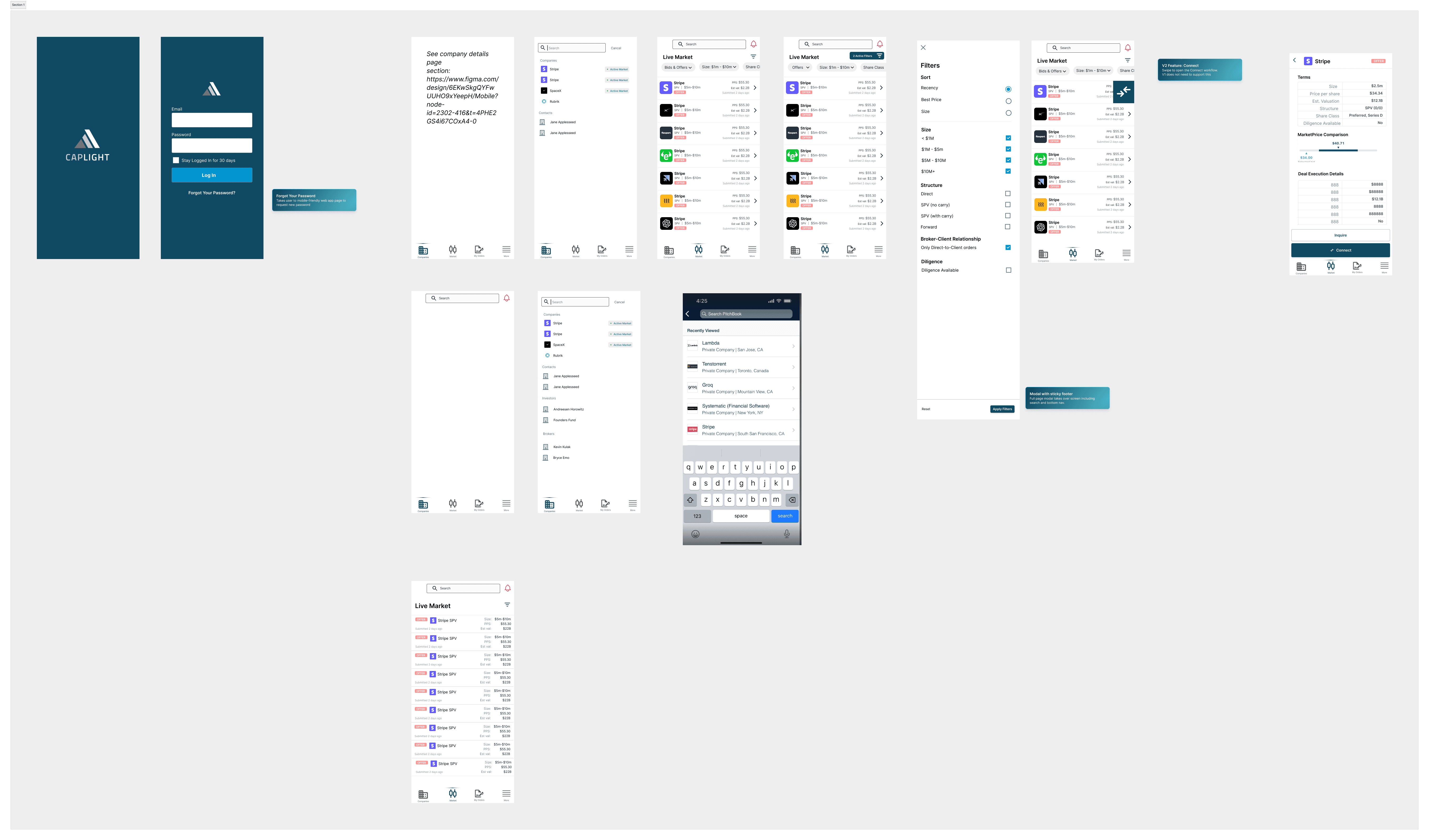
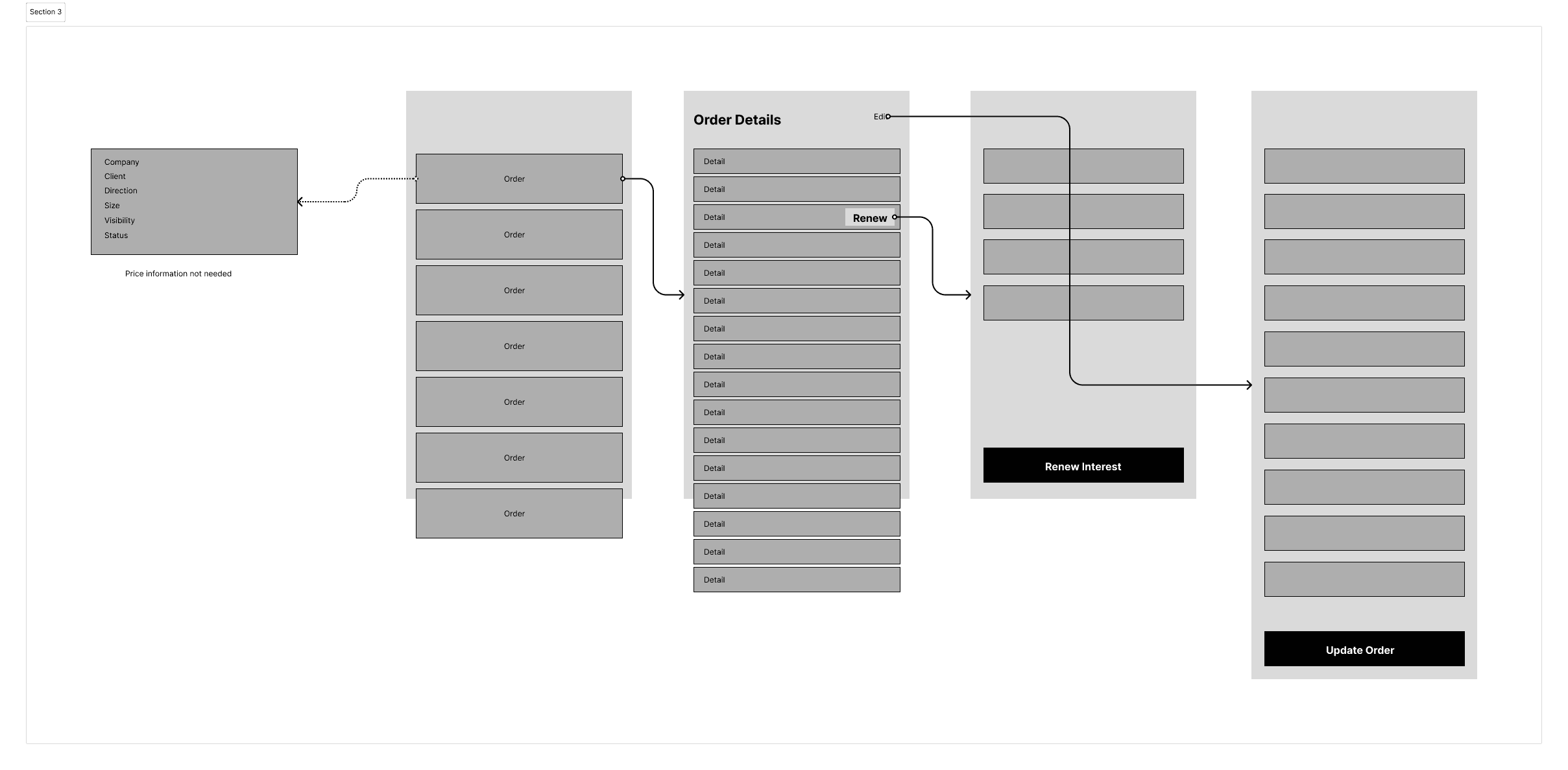
Before diving into high-fidelity designs, I led the creation of low-fidelity wireframes to establish the foundational layouts, flows, and card structures for the mobile app. This process was critical in ensuring that we focused on usability and functionality before committing to polished visuals.
Why Lo-Fi First?
Iterative Problem Solving: Starting with simplified wireframes allowed us to test and refine user flows early in the process, identifying potential pain points without the overhead of detailed design revisions.
Collaborative Alignment: Lo-fi designs served as a neutral canvas for stakeholder feedback, enabling discussions on structure and priorities without distractions from visual details.
Flexibility in Decision-Making: Determining layouts and hierarchies at this stage provided the flexibility to iterate rapidly and pivot when necessary.
Key Outcomes from the Lo-Fi Stage
Layouts: We explored multiple options for how information would be structured, particularly for Orderbook cards and Live Market data, ensuring clarity and ease of navigation.
Flows: User journeys were mapped to prioritize seamless transitions between tasks, such as researching a company and viewing order details.
Card Design: Essential data points were identified for cards, balancing readability with actionability, and setting the stage for the polished designs that followed.
By establishing these critical details in the lo-fi phase, we created a solid foundation that streamlined the transition to high-fidelity designs, ensuring every pixel served a purpose.
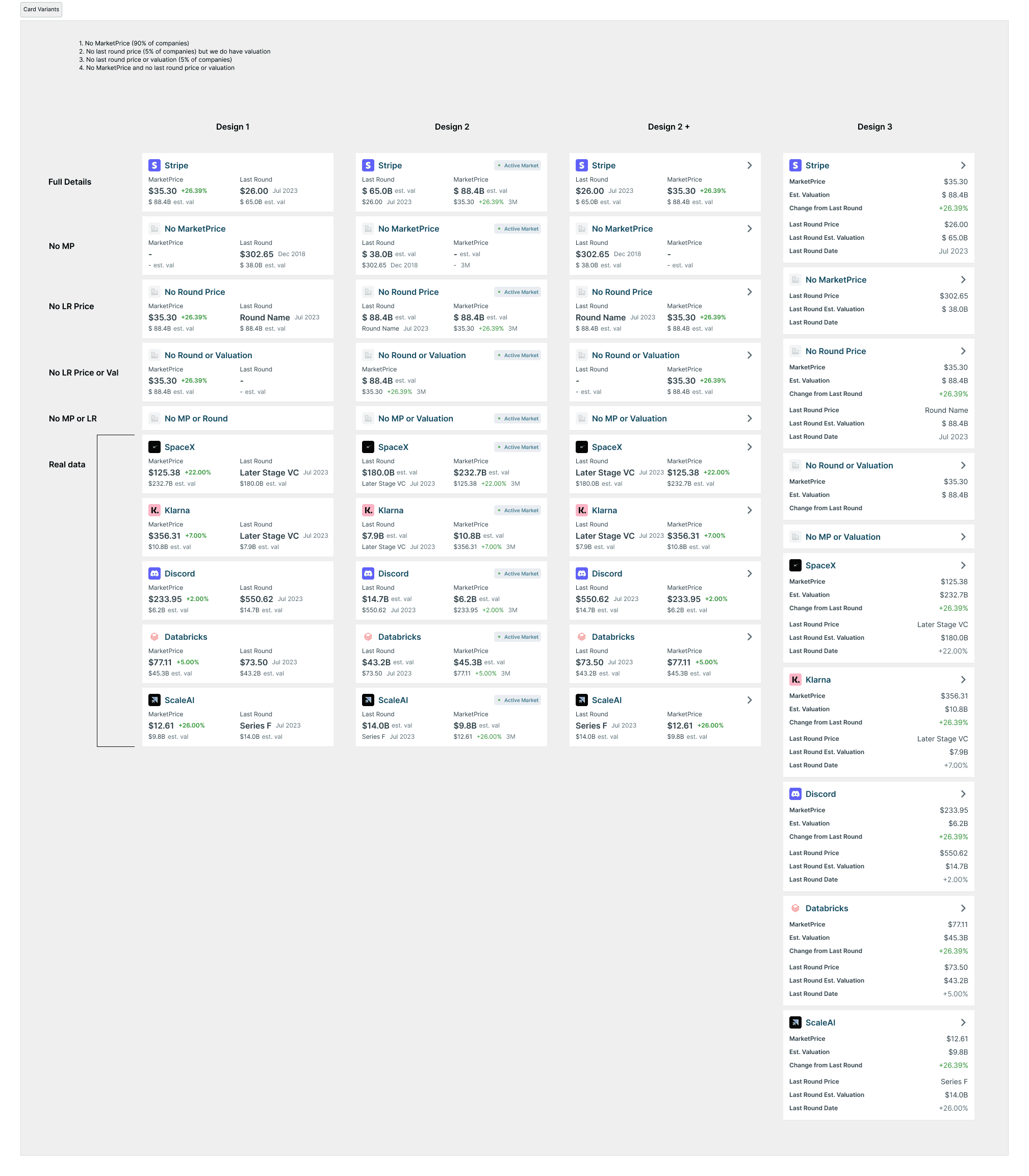
Iterative Card Design

To present this information effectively, I explored multiple card layouts that could condense the data without sacrificing usability. The final design:
Maintained existing patterns from earlier iOS designs to ensure consistency and familiarity.
Leveraged progressive disclosure: High-priority information was displayed upfront, with expandable sections for deeper details.
Balanced clarity with aesthetics: Cards were visually clean yet highly functional, acting as launchpads for user actions.
This redesign not only solved the usability challenges but also elevated the mobile Orderbook experience to feel intentional, not compromised.
Systematic Efficiency: Leveraging the Design System
Caplight’s robust design system was a critical tool in accelerating this project. While initially built for desktop, the system’s responsive principles allowed us to adapt components for mobile quickly. I worked closely with developers to:
Prototype at speed: Iterating on flows and layouts without reinventing the wheel.
Ensure cohesion: Maintaining visual and functional consistency between mobile and desktop apps.
Streamline handoffs: Clear documentation and reusable components reduced development friction.
The result was a seamless workflow that kept us on track to deliver the app within an ambitious 60-day timeline.
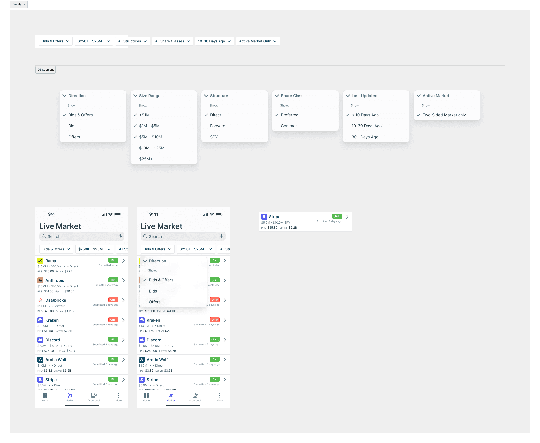
The Final Mobile Experience: Curated, Focused, Intuitive
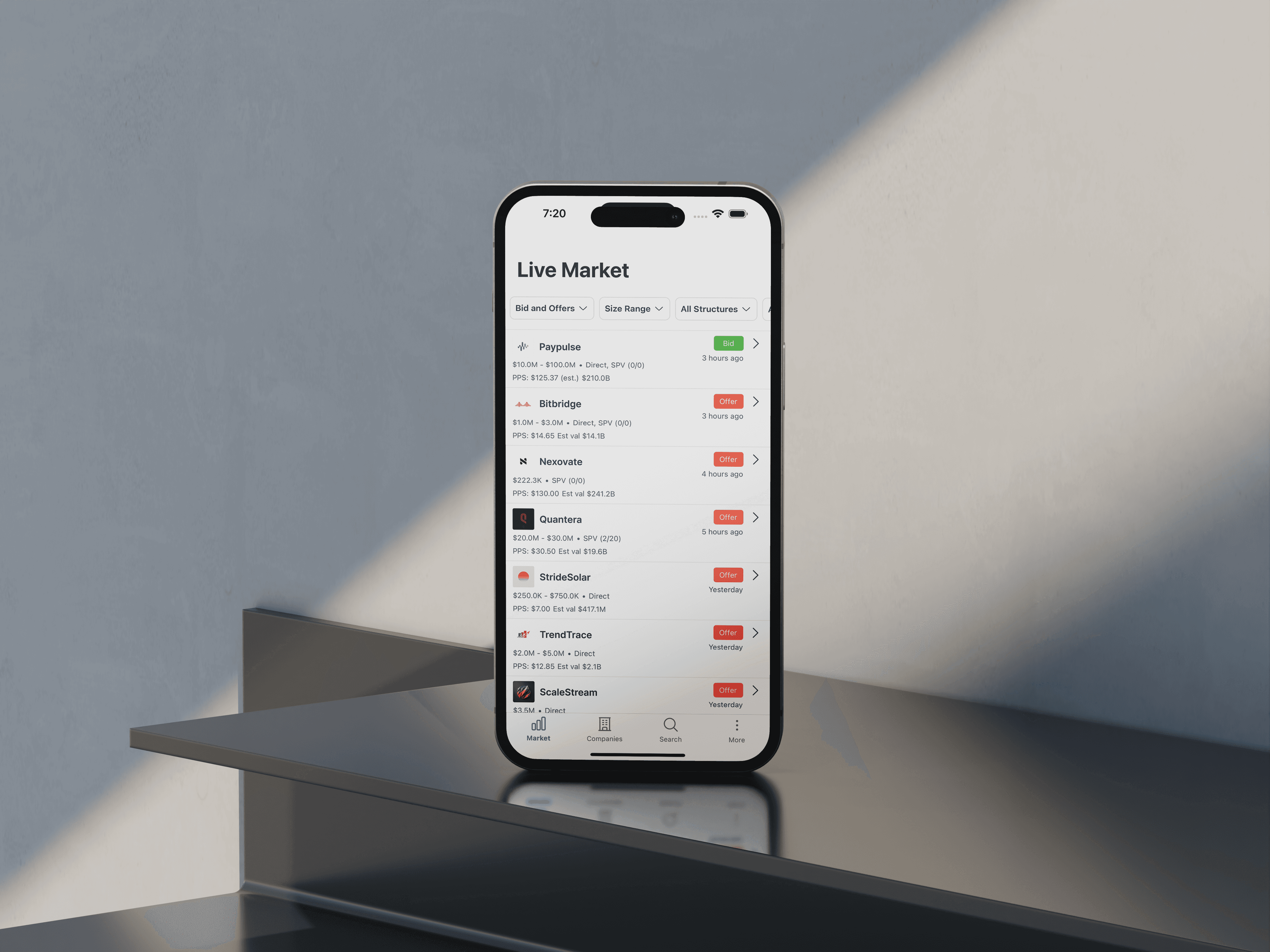
The Caplight mobile app launched with a laser focus on key user needs:
Live Market Data: Users could access real-time insights at their fingertips.
Company Profiles: Quick research tools for client meetings and calls.
Orderbook Overview: Streamlined card designs made it easy to skim and reference orders on the go.
Notifications and News: Keeping users informed of developments in private markets.
Each feature was designed to complement—not compete with—the desktop platform, ensuring that mobile users could act decisively while away from their desks.
Launch and Impact
The app was an instant success, with rapid adoption across Caplight’s user base. Asset managers began using it during deal negotiations, keeping the app open alongside Bloomberg terminals. Brokers praised the ability to reference pricing data mid-call, calling it “indispensable.”
The streamlined design of the Orderbook cards, in particular, received glowing feedback. Users appreciated the balance of detail and simplicity, which allowed them to stay informed without feeling overwhelmed.
What’s Next?
The app’s success has set the stage for future enhancements:
CRM Expansion: Adding features like contact management and deeper order interactions.
Secure Messaging: Enabling brokers to discuss deals and coordinate with teams directly within the app.
Advanced Data Visualization: Bringing more sophisticated analytics to mobile, empowering users with actionable insights on the go.
Conclusion
The Caplight mobile app demonstrates the power of research-driven design, thoughtful execution, and team collaboration. By focusing on user needs and embracing the constraints of mobile, we created a product that doesn’t just extend the desktop experience but enhances it.
This case study highlights my ability to lead, inspire, and deliver results that matter—to users, teams, and businesses alike.
Learnings
This project was as much about team alignment and vision as it was about design. Key takeaways include:
The Power of Research: My initial research and determining a vision, laid the groundwork for success. By presenting actionable insights with compelling visuals, I aligned stakeholders and energized the team.
Constraints Spark Creativity: Mobile’s limitations forced us to prioritize and innovate, leading to cleaner, more user-centric designs.
Consistency Drives Efficiency: Leveraging our design system ensured rapid prototyping, seamless developer handoff, and cohesive branding.
Test, Iterate, Repeat: Usability testing was critical in refining the Orderbook cards and other flows, ensuring they met user needs without friction.
