Building Scalable, Modular Design Systems to Drive Consistency and Speed Across Products.
How to build Design Systems: From Startups to Enterprises
In today’s digital landscape, adopting a modular approach to design is no longer optional—it’s essential. With more screens, devices, and users than ever before, breaking interfaces into reusable modules allows teams to build faster, more consistently, and more effectively.
Throughout my career, I've been entrusted with the task of creating and standardizing design systems for a range of companies, from fast-paced startups to established enterprises with legacy systems. This experience has helped me develop a deep understanding of both the challenges and benefits of building scalable, flexible design systems tailored to specific business needs.
Problem Discovery: Identifying Design Debt
In many of the companies I’ve worked with, the products were already live and being used by tens of thousands, if not millions, of users. Common user and stakeholder feedback often revolved around the same issues:
Inconsistent page designs.
Outdated and unfriendly interactions.
Products that felt visually outdated.
Features that didn’t work as expected.
New products that launched without a clear design framework.
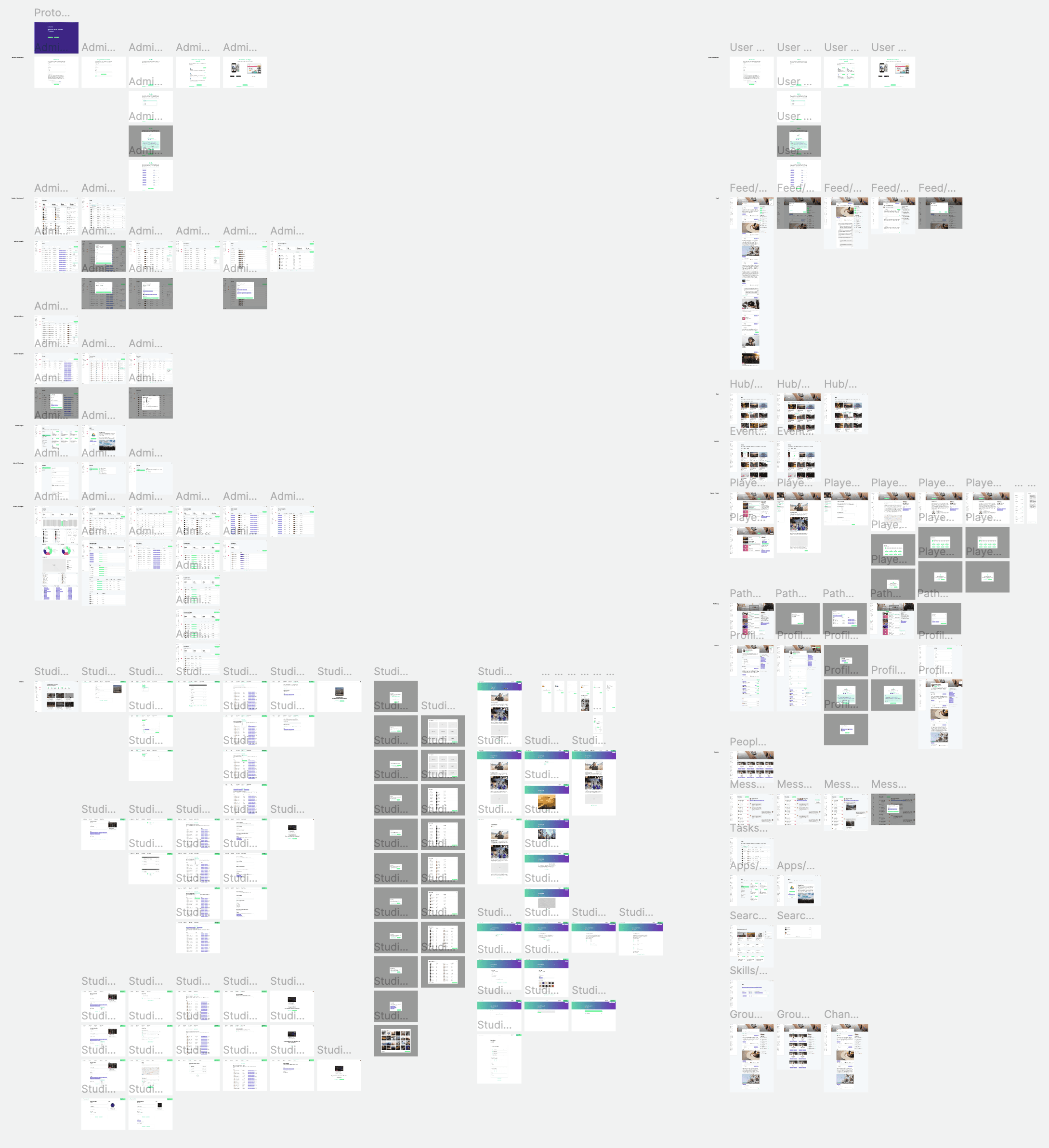
For example, at iPlato, during the discovery phase, we found over 144 different colors used throughout their mobile app. The majority were varying shades of "brand blue," but their core brand color was missing entirely. At PRS for Music (PRSfM), there were nearly 30 different spacing measurements, 18 font size variants, and no defined type scale—resulting in a visually chaotic user experience across desktop and mobile.
In startups, where I had more freedom to design from scratch, the challenge often revolved around providing an optimal user experience with limited resources, leading to design and tech debt. Documenting these issues and presenting them to stakeholders is critical, especially when "design debt" tends to be deprioritized in favor of faster development velocity.
Design Systems as a Product
A design system should be treated as a product in itself—one that evolves alongside the company. It’s not just about creating components and handing them over to engineers. To build a truly effective design system, collaboration is key. Every team—designers, engineers, marketing, product owners—needs to contribute and feel ownership of the system.
Key components of a successful design system include:
Design Language
The foundation, including typography, colors, icons, and spacing.
Design Kit
A Figma library of shared styles, symbols, or components that mirror the engineering team’s component library.
Component Library
Pre-built, reusable components stored in the codebase, version-controlled in a separate repository.
Developer Sandbox
An environment for engineers to test components in isolation, document use cases, and write visual and structural tests.
Documentation
Comprehensive guidelines on how to use the design system, with considerations for both designers and developers.
Governance Model
A set of rules to ensure the system evolves consistently and contributions are managed effectively.
The Structure of a Design System
For companies with a single technology stack or product suite, a unified design system is often sufficient. However, in more complex environments—such as those with multiple products, platforms, or front-end technologies—building modular design systems that interconnect can be highly beneficial.
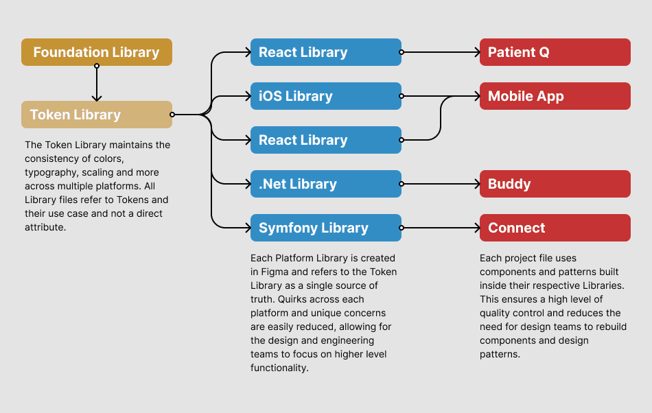
At iPlato, for instance, we developed a design system that fed into multiple products across different platforms and technologies. The product suite included:
MyGP Mobile: A patient-facing iOS and Android app.
MyGP Connect: A web-based tool for practice staff to send SMS messages to patients.
MyGP Buddy: A Windows desktop application for remote consultation and data access.
MyGP Web: A React app for users without access to the native mobile app.
We built a Foundations Library to store core design tokens for color, typography, icons, and spacing. This library cascaded style updates across all products, ensuring consistency. Design kits automatically updated with these foundational tokens, allowing new projects to pull in standardized components from the start. This approach streamlined both the design and engineering processes, enabling quicker project kickoffs and reducing handover time.
Individual product teams had access to production ready designs, using standard components. Time spent working on individual UI elements and components was reduced to the minimum for customization in unique circumstances. This freed up design teams to focus our efforts on building more innovative and user friendly solutions.
Atomic Design and Beyond
The Atomic Design Principles by Brad Frost provide a great foundation for structuring design systems, but as a product scales, it's important to adapt this framework. Rather than rigidly categorizing everything as atoms, molecules, or organisms, I advocate for a more flexible approach:
Foundation: The core design tokens that influence the overall system, such as color, typography, and spacing.
Components: Basic, reusable elements like buttons or headings that are customized implementations of single HTML elements.
Modules: Collections of components that form usable UI patterns, such as cards or navigation bars.
Prototype: Fully assembled pages or interactive prototypes built from components and modules.
This adaptable framework has allowed me to scale systems effectively across both lean startup environments and large enterprise ecosystems.
Design Tokens and Kits
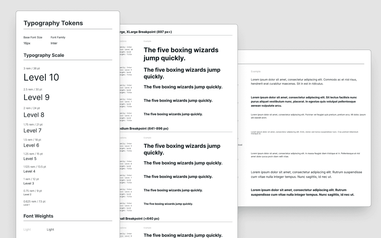
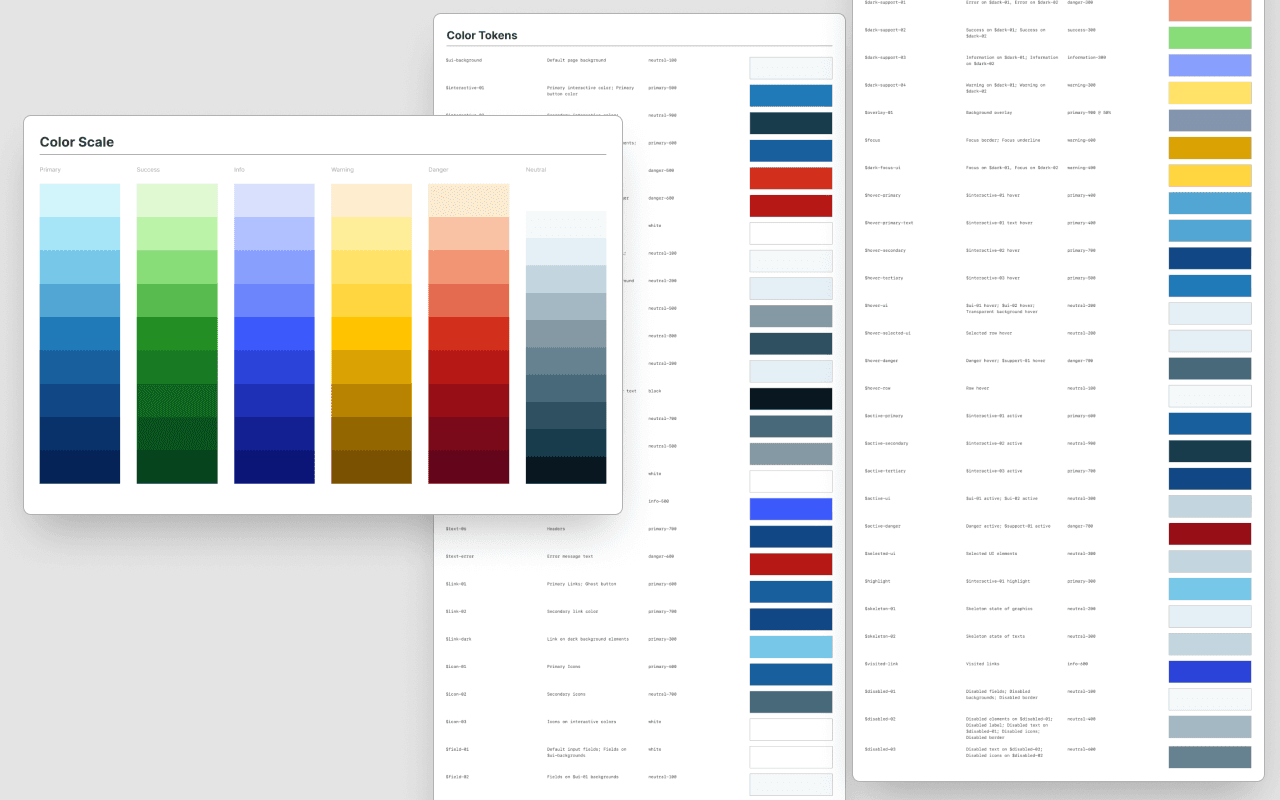
Design tokens—formed from a brand’s identity—are the cornerstone of any scalable design system. They ensure consistency across the product suite while allowing flexibility for updates.
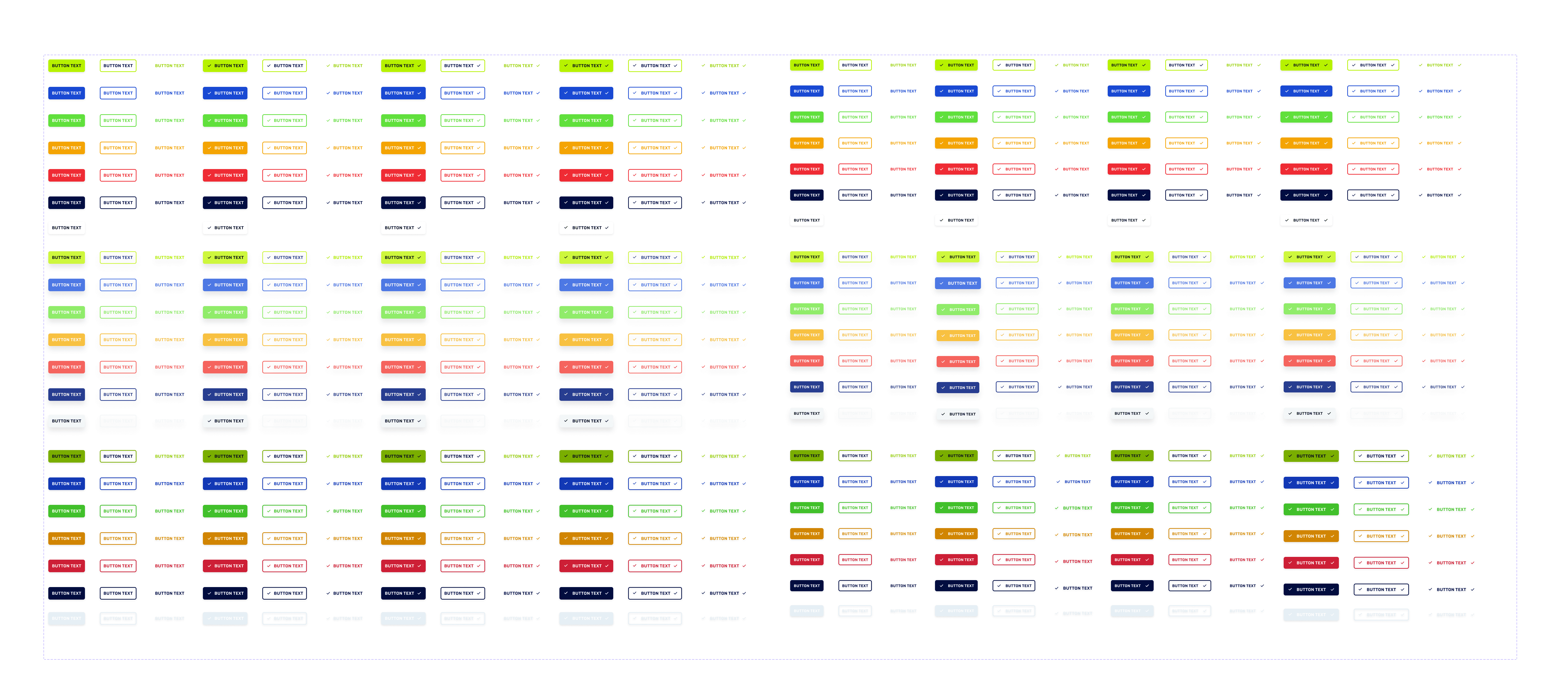
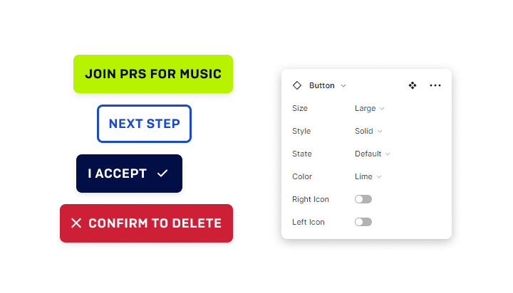
In startups, where speed is often the top priority, I focus on building only the components necessary for the next sprint. By leveraging Figma’s Variants and Auto-Layout features, I can quickly create a vast range of component variations with minimal effort. For example, at PRSfM, we developed a button system with over 100 variations—each customizable by size, color, state, and icon.
In this example, every button type, Primary, Secondary, Tertiary and Semantic button types for every type of action was available for Product Owners and Engineers to implement immediately. This same strategy was implemented at scale for every major component type across the system.
As more components are built, modules naturally emerge, composed of these reusable elements. For example, in Borrow A Boat, the card design consists of a thumbnail image, heading, icon with text, price, and additional iconography. Each of these components can be optimized and updated independently, making it easy to iterate and improve the user interface across the platform.
The Benefits of the Token System
Using design tokens instead of specific color HEX codes or framework classes (e.g., Tailwind) offers engineers a more intuitive, context-driven approach. Tokens define elements by their purpose, not their specific color values, making it easier for engineers to apply the correct styles across components without referencing hard-coded details. This system provides consistent, reusable components and simplifies theme adaptability, such as switching to dark mode or high-contrast accessibility.
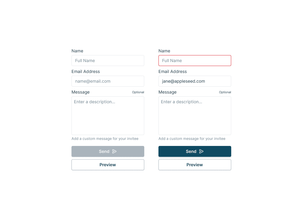
In Caplight’s Design System, for example, tokens define core elements in a form:
Input Fields
Input Textareas
Buttons
A breakdown of how tokens are applied to form components:
Background Color for Form Elements
CSS:
background-color: #FFFTailwind:
neutral-whiteToken:
bg-form
Border for Form Elements
CSS:
border-color: #E3E7ECTailwind:
neutral-400Token:
border-primary
Placeholder Text
CSS:
color: #718693Tailwind:
neutral-700Token:
text-placeholder
Filled Text
CSS:
color: #1A1A1ATailwind:
neutral-1000Token:
text-primary
Danger State Border
CSS:
border-color: #DA1F28Tailwind:
danger-600Token:
border-danger
As seen in these examples, tokens do not rely on specific color values, allowing the design system to be flexible and easy to implement. This approach simplifies engineering and design efforts by clarifying the intent behind each element’s appearance, enabling seamless adaptations for different modes, such as dark mode and high-contrast accessibility.
Prototyping and Rapid Iteration
Once the design system is in place, prototyping becomes faster and more efficient. Instead of starting from wireframes, I can use pre-built components and modules to quickly assemble high-fidelity prototypes. This not only accelerates the design phase but also allows stakeholders to interact with realistic prototypes early on, improving feedback and iteration cycles.
Documentation and Adoption
A design system is only as effective as its documentation. Comprehensive documentation—ranging from component usage guidelines to design rationale—ensures that every team member understands how to use and contribute to the system. In previous roles, I’ve used tools like Notion to create product portals or Confluence to document progress and provide guidelines. In some cases, entire WordPress installations were dedicated to managing the documentation process.
Adoption is often the most challenging part of implementing a design system, especially in legacy products. It’s crucial to have foundational components and patterns tested and ready for deployment. The process is incremental and may involve hybrid UIs where older design elements coexist with newer modular parts. Patience, advocacy, and ongoing communication are essential to gradually introducing the new system into production.
Conclusion
Whether working with a lean startup or a large enterprise, a well-structured design system is essential for maintaining consistency, improving efficiency, and scaling products effectively. From standardizing design tokens and components to creating modular systems that span multiple platforms, I’ve developed and implemented design systems that support both speed and scalability, allowing companies to innovate without sacrificing quality.
Learnings
These experience underscored the critical role of a modular, adaptable design system in enhancing efficiency and scalability within both startups and large enterprises. By structuring systems around reusable components and design tokens, I was able to streamline workflows and unify brand identity across diverse platforms. The process reinforced the importance of treating design systems as evolving products, requiring clear documentation, cross-functional collaboration, and a governance model that encourages adoption and long-term value. This approach has empowered teams to innovate rapidly while ensuring visual and functional consistency across user experiences.
